White Stuff
Digital snippets
Quick-view update Overview
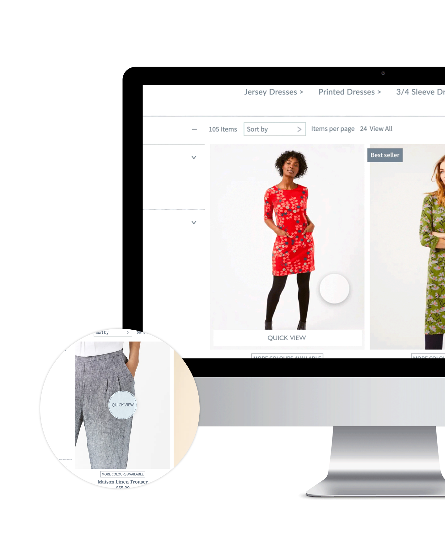
To improve user experience and product visibility on White Stuffs’s e-commerce platform, the hover-state button was repositioned from overlaying the product image to beneath it. This aimed to create a cleaner layout, reducing visual clutter while maintaining clear call-to-action elements.
Process & Approach
Analysed user behaviour to identify friction points in the existing design.
Tested alternative placements, ensuring optimal visibility and usability.
Refined the UI, balancing aesthetics and functionality for an improved browsing experience.
Outcome & Impact
The update resulted in a cleaner, more intuitive product display, improving visual clarity and engagement.
Product Upsell Overview
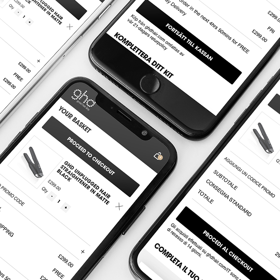
To increase average order value and strengthen customer trust, a curated product upsell feature was introduced. When a user selected an item, a dropdown displayed complementary products, offering a seamless way to discover and add relevant items to their purchase.
Process & Approach
Designed an intuitive dropdown that appeared upon selection, showcasing curated recommendations. Curated product pairings based on user behaviour, trends, and brand alignment. Optimised UI/UX to ensure a non-intrusive yet effective upsell experience.
Outcome & Impact
The feature streamlined product discovery, encouraging higher-value purchases while reinforcing brand credibility through thoughtful recommendations. Insights from this initiative provided a foundation for future personalisation strategies to further enhance customer engagement and sales.
Landing Page Re-design Overview
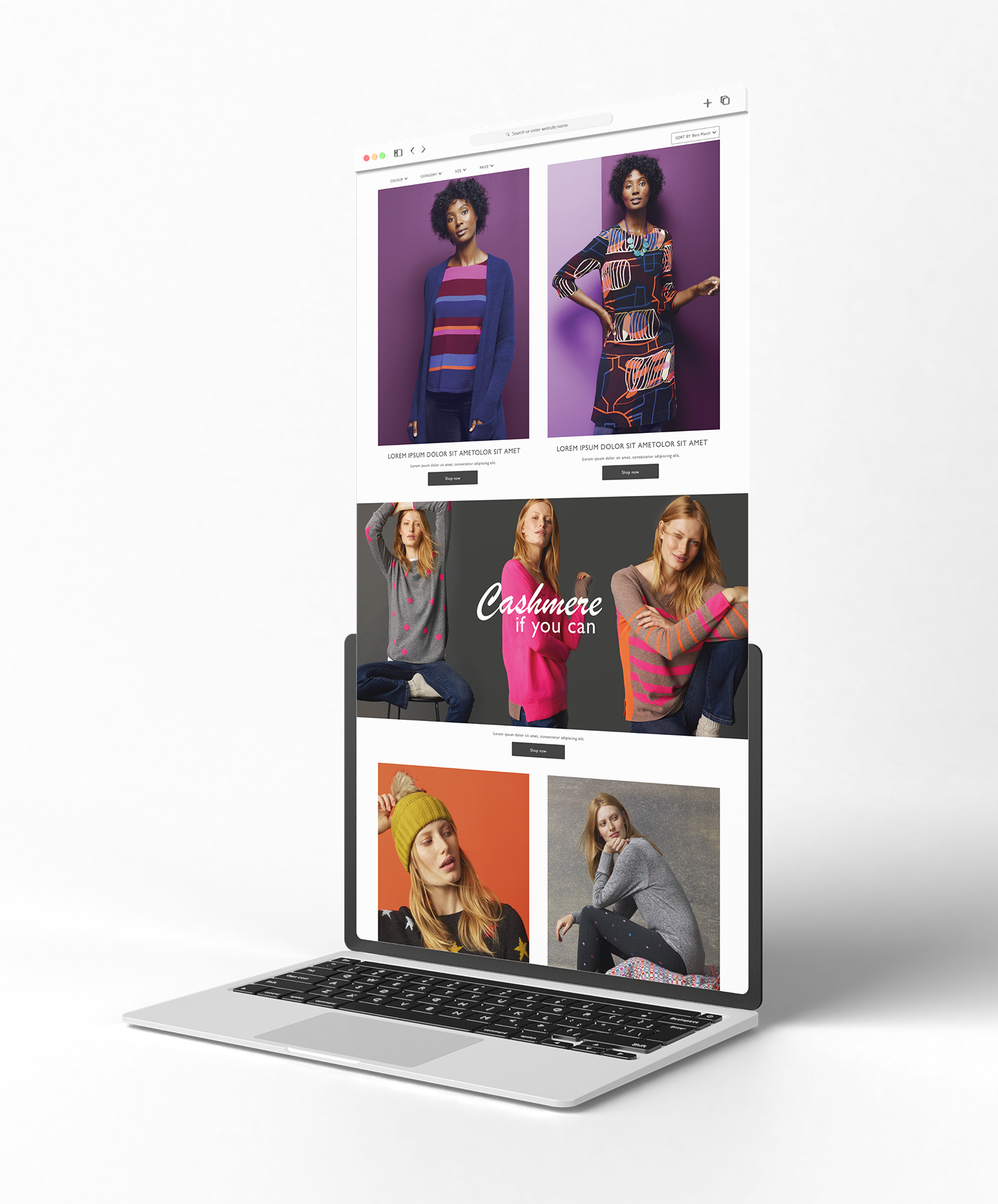
To enhance user experience and visual impact, GHD’s landing pages were redesigned to prioritise hero photography, creating a cleaner, more immersive browsing experience. Additionally, the filter system was restructured, moving from the left-hand side to a top-aligned layout for improved usability and intuitive navigation.
Process & Approach
Refreshed landing pages with bold hero imagery to create a more engaging first impression. Redesigned the filter system, simplifying options and improving accessibility.
Conducted usability testing to validate the new structure’s effectiveness.
Outcome & Impact
The redesign elevated the brand experience, making navigation more intuitive and visually appealing. The refined filter system streamlined product discovery, enhancing usability and supporting a more seamless customer journey.


